Types of Distinction

Editor’s Note: While publishing two special issues in celebration of our first half-century of literary publishing, Tampa Review editors appreciated the chance to reflect on our journal’s typography and identity. In Tampa Review 54 we shared some of our conclusions about its types in a full-page colophon entitled “Companion, Palatino, and Tampa Review.”  However, even with the luxury of a whole page to work with,  we found there was more to say than the space permitted. We directed interested readers here to Tampa Review Online for the somewhat more complete discussion you will find below.

The typefaces you read in Tampa Review and Tampa Review Online provide a unifying visual structure and identity for the journal while also effectively conveying the literary content. In one sense, the types should be invisible, transparently leading readers past the surface appearance of their black strokes and curves on the page or screen to the meanings and impacts the writers achieve through written language. However, in another sense, they are the very essence of the journal, especially important to Tampa Review as “a literary gallery space in print.” Just as an art gallery experience is markedly different if the space in which viewers encounter new works of art resembles an abandoned warehouse with the paintings leaning up against dirty brick walls or propped against derelict machinery, as opposed to the same works presented on freshly painted walls, perfectly lit by track lighting, in a climate-controlled, polished-glass and varnished-wood interior specifically designed for the purpose.

Presentation matters. And it is especially important to us at Tampa Review. As we explain on our website: “The design of the magazine affirms a tradition of excellence in book arts hearkening back to illuminated manuscripts. The editors believe that contemporary works resonate most powerfully within a great tradition.”

Partly because we are published at an academic institution—The University of Tampa—we see ourselves intentionally affirming values and intellectual history of higher education that began with Plato’s Academy in golden-age Athens. We value knowledge and thought. We affirm that these values exist in relationship, and that they resonate and connect.

In Tampa Review these connections are found in our efforts to be both local and global and to suggest links between contemporary visual and verbal art as expressions of contemporary culture. And, of course, this also brings us back to the typefaces that present our face to the world.

When we expanded and redesigned Tampa Review in 1987, we wanted to choose a type for the journal that would be compatible with our mission, one that would embrace continuities with the past while fully committing to the new. Digital type and desktop publishing were still relatively new, and though digital type had been in the works since the 1960s, there were few designers whose work seemed to embody the qualities we sought.

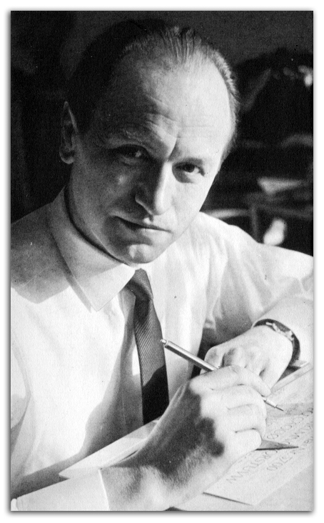
Hermann Zapf in 1960.

Fortunately, there was Hermann Zapf. Born in Nuremberg, Germany, in 1918, Zapf had suffered poverty under the Third Reich. He left school at fifteen and managed to find an apprenticeship as a photographic re-toucher. He began teaching himself calligraphy, and as soon as he completed his apprenticeship, he moved to Frankfurt in search of a job. He soon found menial employment with a graphic studio, Werkstatt Haus zum Fürsteneck, which was directed by Paul Koch, son of the influential German calligrapher and type designer Rudolf Koch. It was in Frankfurt that Zapf made contact with the German typefoundry of D. Stempel and the firm of German Linotype GmbH. He designed his first typeface for Stempel in 1938, and thus began his designs for metal type, working with a highly skilled punchcutter August Rosenberger.


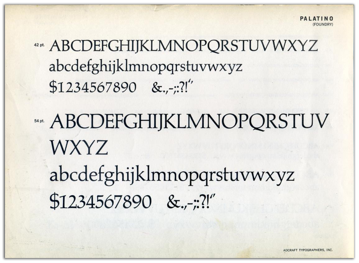
Palatino specimen from Adcraft Typographers, Inc.

Palatino originated as a traditional foundry type designed by Zapf in the spirit of an old-style serif type. It was initially released in 1949 by the Stempel foundry and later by Linotype and others. He named it for the sixteenth-century Italian calligrapher Giambattista Palatino, and the type preserves elements of lettering from the earlier fine-book tradition of the scribes who helped shape the humanist types of the Italian Renaissance. With the variable widths of curves and stems, the letterforms echo the movements of a broad nib pen, preserving a sense of the motions of the calligrapher’s hand.

Unlike most Renaissance typeface revivals, which tend to have delicate proportions, such as a low x-height (short lower-case letters and longer ascenders and descenders), Palatino has a larger x-height and shorter descenders, which we found both readable and historically appealing.

Printing and typesetting had undergone rapid change in the twentieth century. Not long after Zapf designed his Palatino foundry type for letterpress printing, the trend moved rapidly to photographic typesetting and offset lithographic printing. Zapf soon adapted his Palatino type for photographic setting and worked with Linotype to release it for photosetter. But the changes were not nearly over, and Zapf soon began exploring digital renderings of Palatino.

Which brings us back to 1987. When we began looking for a digital typeface with history, elegance, grace, and readability, we were drawn to Hermann Zapf’s Palatino for all the right reasons.

It remained the face for Tampa Review through Issue 49 in 2014. Then, as we celebrated fifty years of literary publishing, we were fortunate to be able to add a new exclusive and distinctive typeface to the journal: Companion Old Style.

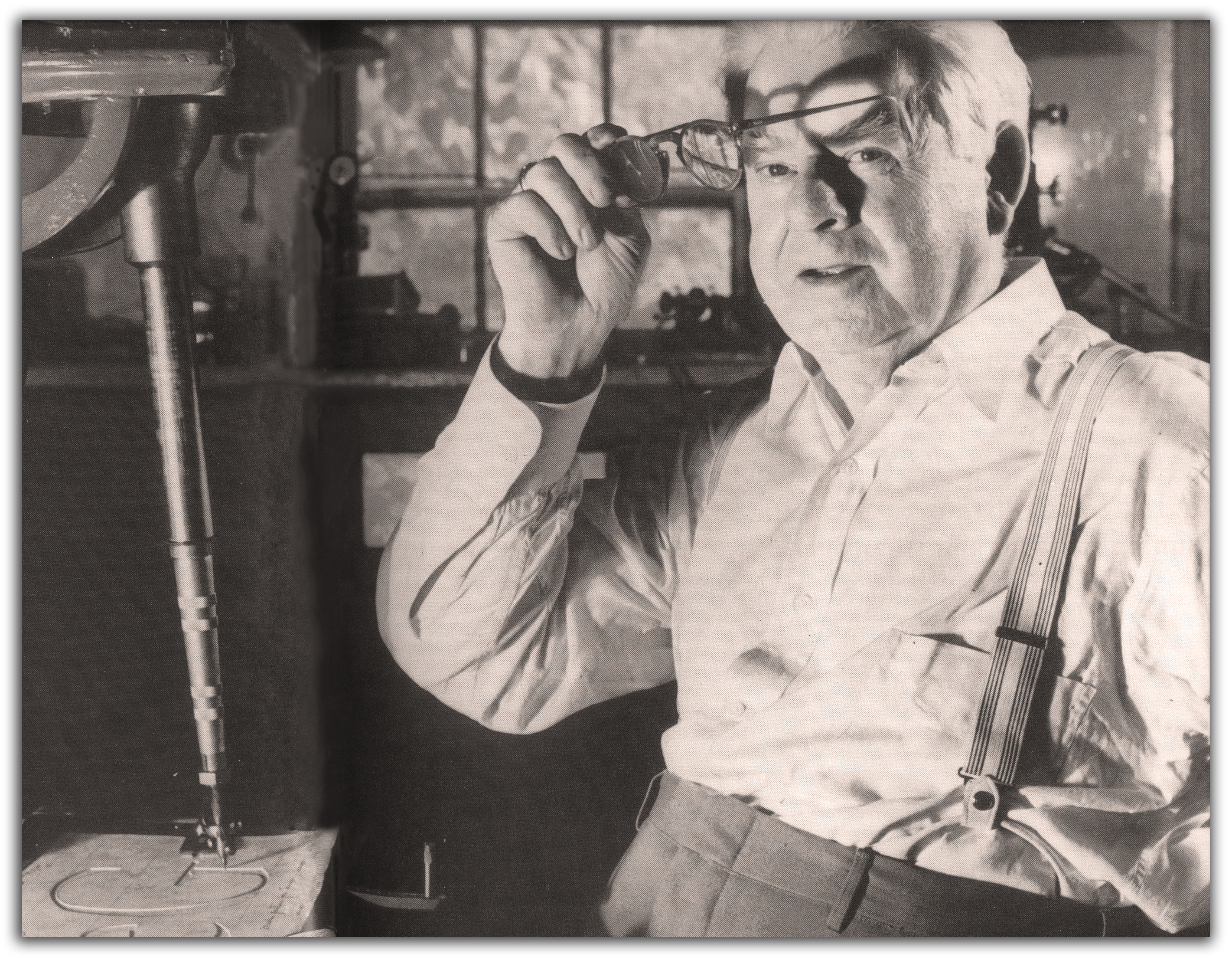
Frederic Goudy at his matrix engraving machine.

And this brings us to another story and another important twentieth-century type designer. Frederic Goudy was born in Bloomington, Illinois, in 1865, 53 years before Zapf, so he is closer to us geographically, and a little further from us in time. Goudy is probably the best known American type designer, and he conveys a commitment to handcraft and calligraphy. Goudy was influenced by the revival of fine printing inspired by William Morris and his Kelmscott Press, but he also developed his own techniques of hand lettering with an influence from advertising. Goudy became the typographical consultant of the Monotype Corporation, and he taught himself all the steps in the making of type, eventually establishing his own foundry and bringing all the processes of designing and casting types within his own hands.

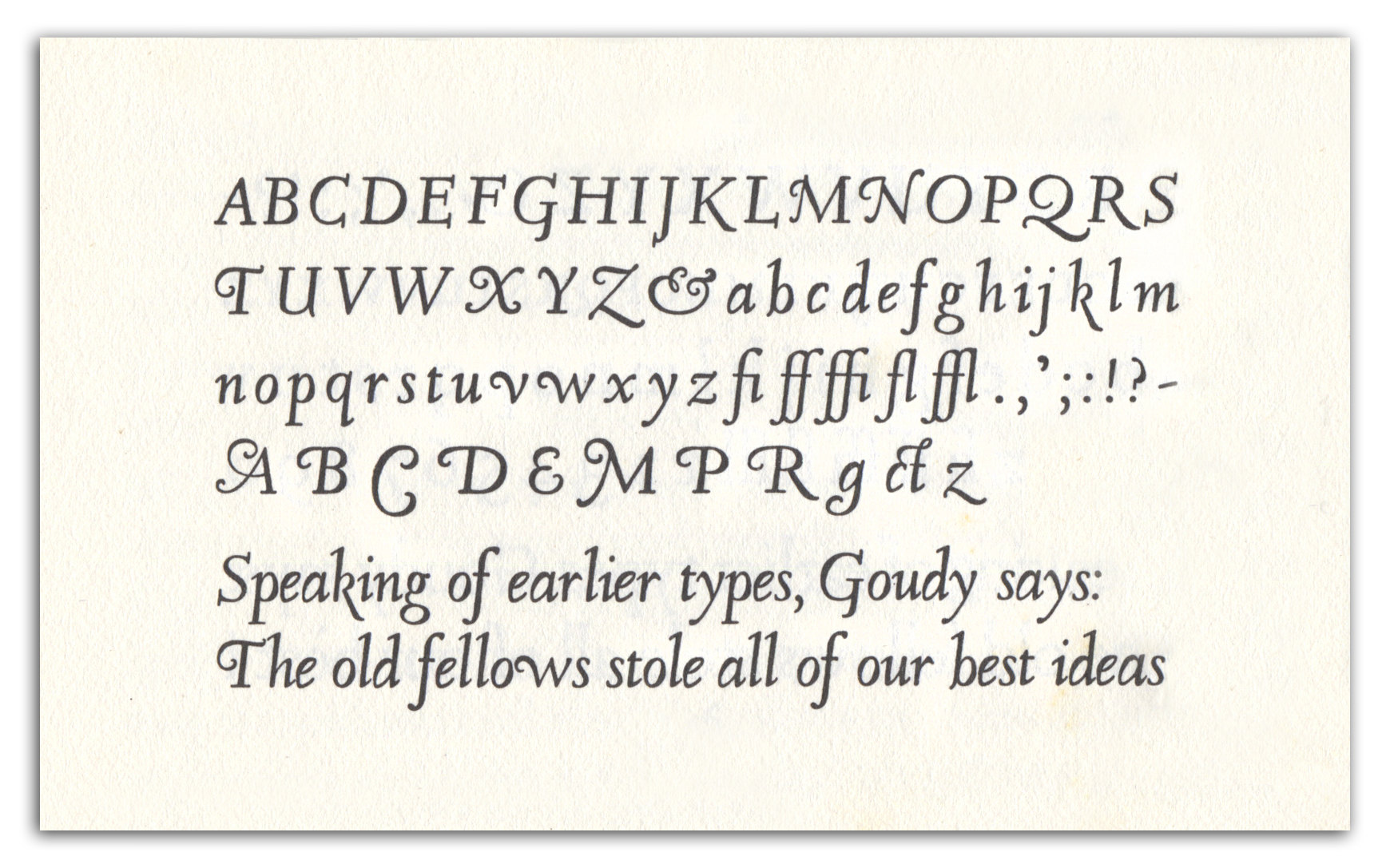
Companion Old Style Italic as Goudy displayed it in A Half-Century of Type Design and Typography.

Goudy had already achieved distinction with types issued by ATF, America’s leading type foundry, when he was commissioned by Henry B. Quinan, Art Director for the Woman’s Home Companion, to design a type for exclusive use of their magazine. The result was Companion Old Style roman and italic, which the magazine first introduced with a fanfare in June 1931. They used the type throughout the 1930s, including first presentations of literary work by Nobel Prize winner Pearl S. Buck, Willa Cather, Dorothy Canfield, John Steinbeck, Shirley Jackson, and Eleanor Roosevelt, but the type was gradually phased out and the magazine became one of the first in the US to adopt Times New Roman as a type in 1943.

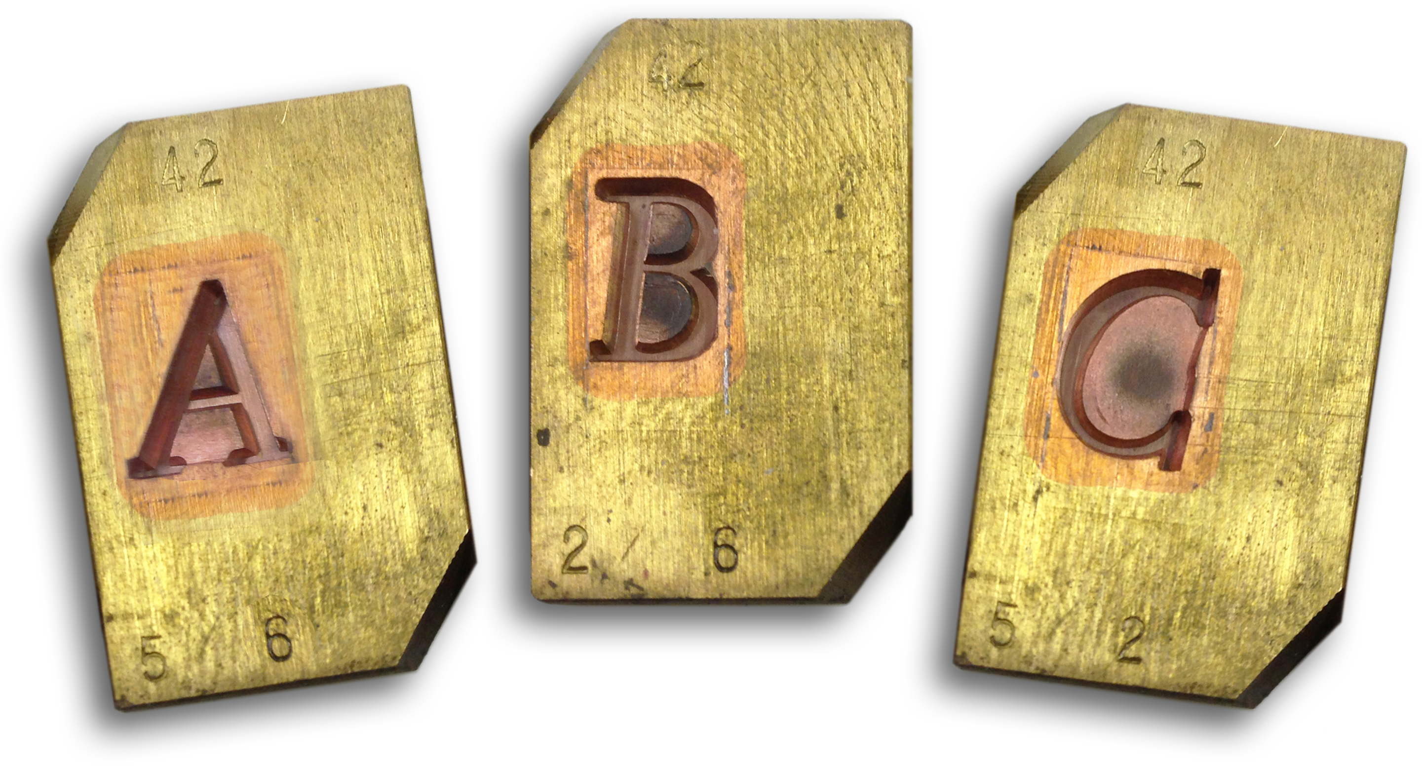
Companion was never commercially available, and it was long thought to have been entirely lost. Fortunately, a single surviving set of matrices was discovered by hobby printer Lester Feller in Chicago in 1976, and TR editor Richard Mathews and artist Barbara Russ, at that time directing Konglomerati Florida Foundation for Literature and the Book Arts, handset, printed, and bound the first book ever set in Companion types, Water Colors by the Ohio poet Hale Chatfield, issued in 1979. Many years later, after Mathews had joined the faculty at the University of Tampa, Les and Elaine Feller established the Feller Family Collections at the Tampa Book Arts Studio, and through their generosity and support from a David Delo Research Grant, the mats found a permanent home at the Studio.

While preparing a keepsake in celebration of the 150th Anniversary of Frederic Goudy, we were fortunate to learn that Steve Matteson, Type Director at Monotype Imaging, had created a digital version of Companion, and he made this available to us in 2015 for our 50th Anniversary celebration in Tampa Review 50. Tampa Review 50 marked the first use of Matteson’s version of Companion in any magazine. We were consciously seeking to express our unique identity, and given that the Tampa Book Arts Studio, our letterpress and fine printing laboratory, had just acquired the only surviving matrices for casting Companion type, we wanted to show off our rare, exclusive typeface. And we wanted our “Number 50” to look special in observance of our fifty years of publishing. We even included a hand-printed letterpress card, set by hand in metal Companion types we had cast from the long-lost matrices, proclaiming Tampa Review to be “your literary companion” for fifty years.

Companion had been designed by Goudy as a display type, and he described it as having “greater consistent original features than any other face I have ever made.” It was used in Woman’s Home Companion for titles, headings, and captions—never for text. But when digital type designer Steve Matteson showed us his new digital rendering, we could not resist a complete commitment.

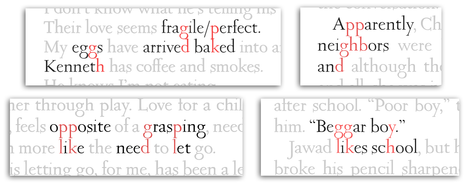
Tampa Review 50, published in 2015, was set entirely in Companion, both text and display. And it proved to be quite readable, though one characteristic of its design that worked well for titles—its unusually long ascenders and descenders—caused problems when set into lines of text. As seen in the examples below, the ascenders and descenders tended to meet. Since that time, we have experimented with Companion in a number of ways.

We made adjustments starting in TR 51/52, increasing the leading (the white space between lines), and by the time we reached TR 53, we had finessed the line spacing and were learning more about the strengths and weaknesses of Companion as a text face. Adding leading created the necessary space between lines, but it also increased the overall white space on an already “light” page, due to the delicate serifs and fine strokes of Companion. While readable in smaller sizes, the overall impact of a full page of Companion type was lighter, lacier, and more “gray” than we wanted­­—the “color” of a full page seemed not quite as weighty and solid as we felt the literary texts deserved.

There were also some significant practical disadvantages: the need for increased leading meant that fewer lines would fit on a page, which meant having to add extra pages (and costs) to each issue. Also, a long-term commitment to Companion for setting texts meant we would lose (and miss) the ability to use a variety of useful type weights—boldface and semibold in both roman and italic—which are often useful in designing an issue and meeting requirements writers placed upon texts.

In short, we found ourselves thinking fondly of the font that Tampa Review had first selected—Palatino. Designed, like Companion, originally for metal type, Palatino bridged the transition from hot type to digital. Zapf himself was fully involved in creating the original foundry type and remained involved with its later release for digital typesetting. In fact, Zapf had been recognized with the Frederic W. Goudy Award from the Rochester Institute of Technology in 1969 and in 1976 was appointed to the world’s first endowed professorship in Typographic Computer Programs at RIT.

Both Zapf and Goudy were looking back with reverence at the warmth of the humanist style of letter forms, both designers preserving the thick-and-thin variations in line weight made by the pen nib in the hand of the calligrapher from the pre-printing age. These two types share open counters, wide bowls, a bracketed but nearly-hairline serif, and a readability on the page.

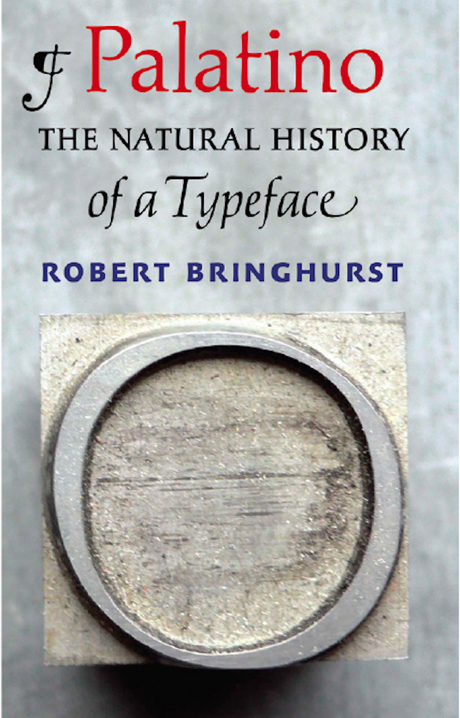
Palatino type has recently been the subject of an entire book, Palatino: The Natural History of a Typeface, by the Canadian poet and typographer Robert Bringhurst. Here he wonderfully articulates many of the values and meanings we find in both of our types. He points out that type design “traces an unspoken but close relationship between the visual arts and literature,” and he explains:

“Letters, that is, have something in common with words: they are much more, as well as nothing more, than signifiers or symbols. They are small and transitory marks made on the surfaces of things in a man-made world, yet they open into the depths of a world where humans are no more than incidental participants.” As Bringhurst reminds us, “type design can participate, like other arts, in something more important and durable than humans, namely the beauty of being itself.”

Bringhurst’s careful, intelligent, poetic and artistic study of Palatino suggests that “Letterforms have often been regarded as honorary lifeforms, inanimate and inorganic objects that can, at the whim of human beings and for purely human convenience, be described as living things.” He suggests that humans co-evolve with their languages in a symbiotic relationship “in which the profit flows both ways” and in which the present forms found in current technologies express the present moment while “retaining certain formal characteristics of great antiquity.” Hermann Zapf articulated a similar idea in a talk at the Library of Congress in 1974: “Type design is a creative art, based on the technologies of the past, which reflects the technologies of both the present and the future. Type design is one of the most visible visual expressions of an age. . . . The hand and personality of the lettering artist actually create the forms that make lasting impressions on the reader. . . . A good design has life, as does every expression of art.”

We hope that readers will subliminally sense both immediacy and history in the typeforms of our journal. With the two types in Tampa Review 54—now also visible here on the pages of Tampa Review Online—we think we have found the right combination of our original text font, Palatino, accompanied by our unique Companion Old Style, for titles and display as it was originally employed in Companion magazine. Using both typefaces we hope will be a statement of identity that connects with our own Tampa Review design history, as well as with the historic calligraphic, letterpress, and literary traditions expressed by two brilliant type designers. At the same time we continue to reach forward with digital tools as well as material artifacts to sustain the handcraft traditions and human touches we believe to be vital expressions of beauty and meaning—vital and living expressions of art.

Tampa Review Online moves to TampaReview.org

Ever since the founding of Project Muse Commons in 2014, Tampa Review Online has been proud to be an active part of the MUSE Commons community, but now that the Commons is being phased out to make room for new Project Muse initiatives, we have moved Tampa Review Online to its permanent home here at TampaReview.org.

Here you will find an online digital companion to the latest printed editions of Tampa Review, Florida’s oldest literary journal. We have preserved all of the online content from Tampa Review Online published since it first appeared in 2012 and we will continue to publish new features, reviews, and other online exclusives.

Project Muse still remains the exclusive online source for all of the contents published in the printed editions of Tampa Review, and going forward, readers will also be able to find both the past and future literary contents of Tampa Review Online posted for individual article access through Project Muse. Over the next months, we will be converting and posting past contents there as time permits.

Meantime, we are looking forward to participating in some of the exciting new developments at Project Muse and to exploring new possibilities and directions for Tampa Review Online at our new home address.

Poet Richard Chess Discusses His Fourth Collection

Poet Richard Chess and the University of Tampa Press have had a long relationship: a few of Rick’s poems were published in Tampa Review 1, the first issue under our new name, back in 1988, and now it’s 2017 already and we’re about to release Tampa Review 54. We published Rick’s second book, Chair in the Desert, in 2000Love-NailedTekiah followed in 2002 (a new edition of his first collection, originally published by the University of Georgia Press), and then Third Temple in 2007. Now we’re happy to be publishing his newest collection, Love Nailed to the Doorpost, about which Judith Baumel has said: “Read this book. Now. If you are reading my words, stop. Enter the room of this book, kiss the mezuzah on its doorposts and prepare to be dazzled.”

As the official publication date approaches, Rick sat down with Tampa Press Director Richard Mathews to talk about the new book, what he’s been up to, and what 2017 will bring.

=====================================================================================================================================================================

Chess_portrait_625pxMathews:  First of all, can you say a little about the upcoming event that will also mark the official book launch of Love Nailed to the Doorpost?

CJS_logo_150pxChess: On March 23, The Center for Jewish Studies at UNC Asheville will celebrate its thirty-fifth anniversary. I’ll also be celebrating my twenty-fifth year as the Center’s director. I’ll be speaking at the event, discussing a few poems by poets we’ve hosted at the Center over the years: Yehuda Amichai, Jacqueline Osherow, Peter Cole, Taha Muhammad Ali. I will also show some video clips from readings and talks going back to 1992 and include a poem or two from my new book in my talk. The title of the talk is “On the Border: Defining, Defending, Protecting, Crossing, Erasing, Transcending,” and I’ll be looking at literal and figurative borders—political, geographic, cultural, religious, and linguistic—and how they alienate us from one another and connect us to one another. We’re expecting a big crowd. It should be a wonderful evening, and I’m hoping folks will be inspired to buy the new book!

Mathews: The variety and focus of work in the new book is surprising and impressive, even to those of us who have known your work well over the years. Can you talk a little about how it came to be?

ImageChess: Since publishing Third Temple, I’ve become a regular contributor to “Good Letters,” the blog published by the folks at Image journal. I contribute a thousand-word (or a little less)Chess_Good-Letters_6 piece to “Good Letters” about every eighteen days or so. I’ve been writing for them for six years now.

Writing for “Good Letters” has enabled me to discover a new voice and style of writing. It has been one of the most exciting developments for me as a writer at this stage of my life. A good number of the pieces are lyrical prose, more like longish prose poems. Some (but very few) are straightforward narrative, analytical, or argumentative pieces of prose. I’ve also written some about my experiences as an educator, looking in particular at ways I’ve been integrating contemplative practices into my teaching.

I am also very active in two other networks that have some bearing on the directions in which my writing and teaching have moved in recent years. First, I’m involved in a national movement exploring the use of contemplative practices in higher education. The organization is called “The Center for Contemplative Mind in Society.” It is the umbrella organization for the “Association for the Contemplative Mind in Higher Education.” I have been on the faculty of ACMHE’s summer seminar in contemplative curriculum development, and I have presented regularly at their annual academic conference. This organization has really become my professional home.

Third-TempleMy work with this organization grows out of my own commitment to a personal contemplative practice discipline. I began my daily meditation and related contemplative practices in a Jewish context, participating in two cohorts of the sixteen-month-long Jewish Mindfulness Teacher Training Program, a national program. My engagement with contemplative life—in Jewish contexts and academic contexts—has been a transformative experience for me over the last 8 years or so—since the publication of Third Temple.

I am a leader on my own campus of an initiative to integrate contemplative practice throughout university life. I’ve also been developing courses that I teach, mostly in the honors program, on topics connected to contemplative practices, including spiritual autobiography and poetry as a spiritual practice.

I have no doubt that my writing has been deeply informed by these new developments in my personal and professional life.

Mathews: Are we seeing all of these strands brought together in Love Nailed to the Doorpost?

Chess: Yes, directly and indirectly. These strands, I think, inform the way I move and think through a number of the poems and pieces of lyrical prose. These experiences have also opened my eyes to certain subjects that I don’t think I would have explored if it had not been for the practices in which I’ve been engaged as an educator, a Jew, and a writer.

Mathews: How did you settle on the title?

Love-NailedChess: Choosing titles is not my strong suit! Not long after the publication of Third Temple, I published the poem “Mezuzah.” As I was putting together the work for this new book, I began to see how love was a recurring theme throughout. The whole idea of love being nailed to the doorpost resonated with me. The title refers literally to the mezuzah that Jews hang on the doorposts of their houses. A mezuzah is a little case that contains a piece of parchment on which is written some passages from Torah, including the commandment to love the Lord your God with all your heart, all your might, and all your soul.  The mezuzah is hung at an angle on the doorpost. The orientation represents a compromise between two rabbinic opinions: one that says the mezuzah should be hung vertically, the other that says it should be hung horizontally. Support for both can be found in the sacred texts. So, the rabbis compromise and hang it on an angle. Compromise seems to me to be a necessary move if one hopes to remain married for a long time. Compromising can be a way that two people “meet” each other and form something new out of that “meeting.” I’m not talking about literally meeting. Not even exactly meeting halfway. Love is something that moves, that grows, that changes. It isn’t something that we think we can command or force ourselves to feel. And yet, there it is, commanded, and fixed in place on our doorposts, a reminder that that’s how we should act at home and in the world: in a loving way. It’s a challenge. The most important challenge. There’s no escaping it. It’s nailed to the doorpost.

Mathews: Can you think of any memorable personal anecdotes involved with the writing of the book that might be of interest to readers?

Chess: Well, one of the first prose pieces I wrote that led to the lyrical prose pieces in the book was for the Jewish Mindfulness Teacher Training Program. There were about fifty of us participating in the program, and as a part of it, each of us had to write an interpretation of a passage from the Torah. The interpretation was supposed to be written through the lens of mindfulness meditation practice. And it was supposed to include instructions for a meditation practice suggested by the particular passage from Torah on which we were writing. Of the fifty-plus participants, I was one of the only people who wasn’t a rabbi. Needless to say, I was quite intimidated about interpreting Torah for a group of rabbis, most of whom I had hardly spoken to because every time we were together in person during the sixteen-month program, we were together for a silent retreat! The participants didn’t have opportunities to talk to each other! But, this exercise helped me work through some of my insecurities about my limited knowledge of rabbinic literature and commentary. More importantly, it helped me gain some trust in my intuitive and personal responses to Torah. While the most lyrical pieces of prose I have wound up writing sound way more like poems than they do like the prose I wrote during the JMTT program, the one piece of writing I did in that program cleared the way for me to begin the journey during which I discovered this new way (for me) of writing.

Mathews: What readings or signings are coming up that you’d like us to mention?

Chess: I’m working on scheduling some readings and workshops out West for this summer. I’ll be doing an event in early June at the commencement ceremony for the Judaic Studies Program at Portland State University. At the end of June, I’m doing an event with my friend Danny Maseng at his community, Makom LA. I’m also in talks with friends in Seattle about setting up readings and workshops there. Basically, I’m hoping to fill June with readings and workshops from Seattle to San Diego. And, I think I’ll be coming to the University of Tampa to do some things with the Center for Faith and Values and the Honors Program and the Writers Series, probably in February. I’ll be scheduling readings in North Carolina and closer to home for the fall. I’m happy to go anywhere to do a reading and/or lead a workshop or two. Check out my website for a more complete sense of what I can offer. ( www.RichardChess.com )

Mathews: Congratulations again, Rick. The pre-publication praise has been tremendous, and we are very proud to be publishing such a rich, honest, and transformative fourth book.

Chess: Thank you!

–––––––––––––––––––––––––––––––––––––––––––––––––––––––––––––––––––––––––––––––––––––––––––––––––––––––––––––––––––––––––––––––––––––––––––––––––––––––––––––––––––––
Love Nailed to the Doorpost is available from the University of Tampa Press
in both hardback and paperback editions.

TR Editor Yuly Restrepo visits Int’l Poetry Festival of Medellín

One of the most vibrant literary gatherings in the world takes place each year in Medellín, Colombia: The International Poetry Festival of Medellín or Festival Internacional de Poesía de Medellín. Founded in 1991, the Festival has consistently offered poetry as an eloquent counterweight to the violence so much associated with the city. It was awarded a Right Livelihood Award in 2006, a prize sometimes referred to as the “Alternative Nobel Prize” with a citation that it was given “for showing how creativity, beauty, free expression and community can flourish amongst and overcome even deeply entrenched fear and violence.” The award and the Festival have taken on special significance in the months since this summer’s gathering. This year when the Nobel Prize Committee announced that Colombian President Juan Manuel Santos will receive this year’s Nobel Peace Prize, the news came just days after Colombian Laureates of the Right Livelihood Award had called for a ‘Yes’ vote in the failed October referendum on the peace deal with the FARC.

Yuly

Tampa Review Fiction Editor Yuly Restrepo was born in Medellín. In 2001, at the height of Colombia’s civil war, she and her family moved to the United States, where they were granted political asylum. Yuly is now a naturalized citizen of the United States, and a writing professor at the University of Tampa. In the summer of 2016, she traveled to Medellín to work on and do research for her novel-in-progress, which is set in Colombia and deals with the country’s civil war. During her time there, she attended and wrote about the poetry festival, which coincided with the signing of a peace agreement between the Colombian government and the FARC, which has resulted in a cease fire, after over fifty years of violence. Yuly is shown at left in a photo from the trip at the foot of the Puente de Occident, or Bridge of the West, about 50 miles north of Medellín, Colombia. —Ed.

=====================================================================================================================================================================

Otraparte_1

The first event I attended at this year’s 26th Annual International Poetry Festival of Medellín was a reading meant to showcase contemporary Colombian poetry. On an overcast Sunday afternoon, seven young Colombian poets gathered at the Otraparte Museum/Café, created and built for the purpose of preserving and spreading the legacy of the great Colombian writer Fernando González. They performed their work to an attentive, if small, audience. But the Festival was just getting started, and there was a significant community event competing for attendance that afternoon.

The first reader, local costumbrist poet Lina Trujillo, thanked the audience for attending on an afternoon when one of the city’s soccer teams, Deportivo Independiente Medellín, would play the championship match of the Colombian tournament. The reading featured poets from Medellín and other Colombian cities, and poets who, like many other Colombians, live outside the country. Hector Cañón stood out among them, with an undeniably environmental focus, as well as some work on the violence that has besieged Colombia for so long. This last aspect of his work is evidenced in lines such as “I come from seeing fathers and mothers crying/over the deaths of their children/with fallible anticipation.” Another standout was Fredy Yezzed, who in “The Unpublished Diary of the Viennese Philosopher Ludwig Wittgenstein” writes, “1.1 Poetry is a garden: a garden that speaks of other gardens.”

Otraparte_2

Later that night, as I rode the metro amid screams of celebrating soccer fans clad in red and blue jerseys, I thought about the absolute attention of the audience at Otraparte, and I remembered my first poetry festival six years earlier. Back then, people packed public squares and let the rain soak them, sometimes to listen to poets who read in English or Dutch, whose work no one had translated for them. I realized that, even if the numbers didn’t compare, poetry fans in Medellín could be as fervent as the people waving flags on the street and sending fireworks into the night sky to celebrate the team’s victory.

The following days reaffirmed this feeling. The festival, which took place June 18-25, 2016, featured more than 110 poets from countries ranging from Burkina Faso to Australia, including representatives from indigenous nations, such as the Mapuche from Chile and the Zoque from Mexico. It consistently had well-attended or packed venues. The poets spent their week in Medellín offering readings, lectures, workshops, and conversations to audiences from many age groups and walks of life. Additionally, the festival held film screenings, musical performances, and plays in venues ranging from universities to museums to public parks.

This year the festival had two main themes: the work of French poet Arthur Rimbaud and the Eleusinian Mysteries. To expand upon the latter, Boston University’s Carl A. P. Ruck, co-author of The Road to Eleusis: Unveiling the Secret of the Mysteries, participated in several events to celebrate the memory of this ancient city and its rites. As for Rimbaud, Colombian writers like Albeiro Montoya and Juan Manuel Roca, as well as French poet Alain Borer, discussed the poet’s work and life.

The festival, organized and sponsored by Prometeo, one of the oldest literary magazines in Colombia, has grown exponentially since its inception in 1991. That year, sixteen Colombian poets decided to hold an event called “A Day with Poetry” at the iconic Cerro Nutibara, a hill located square in the center of the city, better known for its tourist attraction, the Pueblito Paisa, a model of the traditional small Antioquian town.

Prometeo became involved in the festival the following year, when thirty-seven poets from eight European and American countries participated. That year, the event also began to integrate musical performances, as well as lectures and film screenings. The unexpected attendance, about 20,000 people total, led the organizers to improvise readings on the streets, using megaphones instead of microphones, for the people who crowded outside the packed venues.

The growth has steadily continued. In 1992, a representative from an indigenous nation, the Kuna-Tule from Panama, participated in the festival for the first time. In 1996, thanks to the success of the festival, the first School of Poetry was held, an event that has taken place ever since. In 1999, the festival offered the first prize for poetry in the Castilian language. In 2005, events from the festival aired on television for the first time, and Nobel Prize winner Wole Soyinca was one of the featured poets. In 2009, the festival was declared part of Colombia’s cultural heritage by the national government. In 2011, Pulitzer Prize winner Rita Dove participated in the festival.

TranslatorsThis year, in addition to panels and readings focusing on the legacies of Rimbaud and Eleusis, the festival featured readings that gathered poets from diverse ages, nations, languages and styles. On Thursday evening, I attended a reading featuring Albeiro Montoya (Colombia), Adriana Paredes (Mapuche Nation, Chile), Keki Daruwalla (India), Antonio Trujillo (Venezuela), and Alain Borer (France). By now, the festival organizers have started to provide those who write in a language other than Spanish, and cannot translate their work into Spanish themselves, with both a translator and a local actor who reads their poetry for the audience in Spanish. At this particular reading, the audience was delighted to hear and understand the images in Daruwalla’s poem honoring Federico García Lorca, first in English and then in Spanish: “Sandwiched between your rivers/‘one lament and the other blood’/the land will flame like a tongue/of fiery green/threading the Sierras.” The audience also enjoyed Borer’s extremely brief, surprising poems and his delight at being in Medellín.

Mural

The next day I attended Colombian poet Leo Castillo’s lecture on “The Damned Poets.” The lecture took place at the Sala del Concejo of the Antioquia Museum, a room that features an imposing mural by maestro Pedro Nel Gomez entitled La República, which depicts important events in the liberation and development of the Colombian nation. The room was packed with about 150 people, and the lecture turned into a spirited debate. When it became evident that Castillo was more interested in discussing details of the poets’ private lives, such as Paul Verlaine’s proclivity for sex workers, or Rimbaud’s possible homosexuality, than about their work, the audience took it upon itself to become an active participant in the conversation and demand a better quality of work from the presenter.

A few days later, I went to EAFIT University’s campus to listen to the work of Rubén Darío Lotero (Colombia), Judith Crispin (Australia), Hugo Mujica (Argentina), and Samm Monro, aka Comrade Fatso (Zimbabue). The Colombian poet read short vignettes from everyday Colombian life, while the Zimbabwean entertained the crowd with his spoken word style focused on the social and political ills of his country. The Australian, with her expansive, dreamlike poetry, was also well received. However, it was the Argentine, with lines such as “He fell weightless/like eyelids,/at nightfall or a leaf/when the wind rather than whip away, sways,” which he wrote about the death of his father, who won over the audience completely.

EAFIT-Univ

The closing ceremony, a reading marathon featuring most of the participating poets, took place at Parque de los Deseos, and again was packed. People in attendance wore t-shirts with Rimbaud’s likeness printed on them and carried around festival tote bags and the festival edition of Prometeo magazine, which includes work by all the participating poets, in English and Spanish, as well as Carl A. P. Ruck’s essay “Memory of Eleusis.”

I had to ask myself why in a country where the population reads an average of one book per year, this festival has such massive success, and why attendance has soared to hundreds of thousands. I’ve pondered the question in the days since the closing ceremony, and I think the answer goes back to what the poets who founded the festival had in mind when they got together for the first time in 1991. In that year, war was on every Colombian’s mind. The cartel wars, the war on drugs, the war between the guerrillas and the government. In 1991, bombings, drive-by shootings, political assassinations, and massacres in public areas were daily occurrences in Medellín. War was on everyone’s lips, and fear was in everyone’s thoughts. So the festival came as a response to that fear. It started because the city’s spirit was broken and in dire need of repair. It began because poetry was a way to create and reaffirm life in a place where death was our daily bread. In a city that still had some of its darkest days ahead, poetry served as a way to get closer to the light. It has been so for twenty-six years in a row.

On June 23, 2016, during the week of the festival, the Colombian government and the FARC signed a peace agreement, after more than fifty years of civil war. The rebels agreed to a final cease fire and future reintegration into society. The country met the possibility of peace with joy and trepidation. After all, the war has left hundreds of thousands dead and millions displaced from their homes. It has left more than fifty years of destruction and suffering. The trepidation will continue for some time to come, but so will the joy. And through it all, in the city of Medellín, there will remain the life-giving power of poetry—and the masses who will come to be part of an event that stands against war and fear and death.

An Email from Malcolm Garcia

Malcolm Garcia in a village in Afghanistan. Photo by Peter Andrew Bosch, from Tampa Review 33/34, 2007.

Malcolm Garcia in a village in Afghanistan. Photo by Peter Andrew Bosch, from Tampa Review 33/34, 2007.

One of the highlights of Tampa Review 49 is a new essay by J. Malcolm Garcia, who continues to witness and reflect on trouble spots around the world. His latest contribution, “Praying in Reyhanli,” was written after spending time with refugees in Syria and Turkey. 

Recent events have only underscored the importance of intelligent, unbiased reporting from this part of the world.  The horrific beheadings of journalists Steven Sotloff and James Foley reminded me of the imminent danger that Malcolm faces in his freelance work. As I unpacked the first hardback copies of Tampa Review 49 from the printer while listening to some of the latest reports on NPR, I found myself wondering where Malcolm might be at the moment and what new reporting assignments he had in mind for himself.  I decided I’d ask him, and I thought that readers might also find his reply interesting.  With his permission,  I’m posting it here on Tampa Review Online, where it can serve as an introduction and a supplement to his work on our printed pages. 

-Richard Mathews

========================================================================

Dear Richard,

Thank you for your note. Some flattering news: “My Middle Age” [published in Tampa Review 45/46] was named a “notable” essay in The Best American Essays 2014. Thank you again for accepting it for publication and putting up with the odd proofreading process we went through while I was in Syria and Turkey.

I appreciate your offer to write an updated commentary or add some recent notes on developments in the Middle East. The translator I worked with has returned to Syria and we’ve been communicating via Facebook. I’ll try to reach him via Skype, and perhaps I could put together some sort of essay about our experiences. At the same time, the translator I worked with in Kabul, where I just returned from, is under threat by pro-Islamists for working with a Westerner. These two developments together might make for interesting reading.

If I had to categorize myself, I’d say I’m kind of a grassroots writer. Rather than offer my personal thoughts, I’d like to get the commentary from the ground, from the people feeling it, if that makes sense. I’m not much of a pundit.

I’m working on a couple of things—a trip to Cambodia to write about deportees there, and in a similar vein, I’m looking at going to Tijuana to write about deported veterans. These are guys who served honorably in the U.S. armed forces, got out, committed a felony (usually drug-related), and because they are not citizens they are deported to their country of origin, which they know about as well as you and I would,  since they grew up in the States but just weren’t citizens because they had been born in another country. It’s a substantial story, and very few people are aware of it.

Also, I’m looking at Iraq. But it’s a matter of balancing logistics and costs. I’m not much of a freelancer in terms of livelihood. My outlets are mostly small magazines that through no fault of their own cannot pay much, if at all. I’m blessed to have been published in Tampa Review and other small magazines, because the editors allow and even encourage creative approaches to nonfiction storytelling. So I have no complaints. But as a result I work temp jobs in-between travels to earn the money to go.

I had one commercial gig that paid handsomely, but the editors butchered the story and they made it clear I had no input in the process. So, I’ve sworn off them. And as a result of sticking to my voice despite its faults, I have a “notable” essay of which I am very proud in a magazine I’m very proud to be in . . . and if there is an afterlife, I hope my good friend Tom (the subject of “My Middle Age,” if you recall) is proud of this, too.

Well, I’ve prattled on longer than you asked or have time for, so I’ll close now, but I’ll get back to you about the commentary and let you know when I think I can get you something. Right now I’m working up my new Afghanistan piece (I spent three weeks with street children), but I’ll make time for TR, no problem. It is my hope to submit again to you next year when one or all of these proposed trips I described jells. I know I’ll have more than one story out of each of them, and I’d be pleased to be considered for publication again in Tampa Review.

All best,

Malcolm