Editor’s Note: While publishing two special issues in celebration of our first half-century of literary publishing, Tampa Review editors appreciated the chance to reflect on our journal’s typography and identity. In Tampa Review 54 we shared some of our conclusions about its types in a full-page colophon entitled “Companion, Palatino, and Tampa Review.” However, even with the luxury of a whole page to work with, we found there was more to say than the space permitted. We directed interested readers here to Tampa Review Online for the somewhat more complete discussion you will find below.
The typefaces you read in Tampa Review and Tampa Review Online provide a unifying visual structure and identity for the journal while also effectively conveying the literary content. In one sense, the types should be invisible, transparently leading readers past the surface appearance of their black strokes and curves on the page or screen to the meanings and impacts the writers achieve through written language. However, in another sense, they are the very essence of the journal, especially important to Tampa Review as “a literary gallery space in print.” Just as an art gallery experience is markedly different if the space in which viewers encounter new works of art resembles an abandoned warehouse with the paintings leaning up against dirty brick walls or propped against derelict machinery, as opposed to the same works presented on freshly painted walls, perfectly lit by track lighting, in a climate-controlled, polished-glass and varnished-wood interior specifically designed for the purpose.
Presentation matters. And it is especially important to us at Tampa Review. As we explain on our website: “The design of the magazine affirms a tradition of excellence in book arts hearkening back to illuminated manuscripts. The editors believe that contemporary works resonate most powerfully within a great tradition.”
Partly because we are published at an academic institution—The University of Tampa—we see ourselves intentionally affirming values and intellectual history of higher education that began with Plato’s Academy in golden-age Athens. We value knowledge and thought. We affirm that these values exist in relationship, and that they resonate and connect.
In Tampa Review these connections are found in our efforts to be both local and global and to suggest links between contemporary visual and verbal art as expressions of contemporary culture. And, of course, this also brings us back to the typefaces that present our face to the world.
When we expanded and redesigned Tampa Review in 1987, we wanted to choose a type for the journal that would be compatible with our mission, one that would embrace continuities with the past while fully committing to the new. Digital type and desktop publishing were still relatively new, and though digital type had been in the works since the 1960s, there were few designers whose work seemed to embody the qualities we sought.
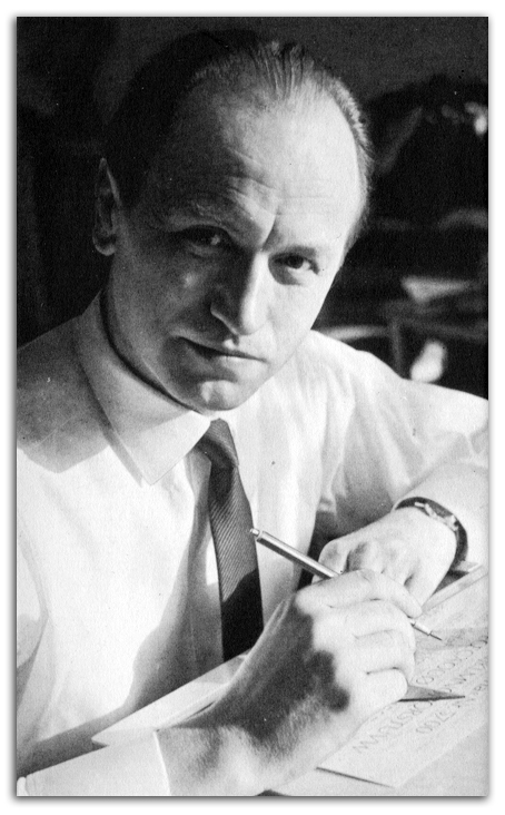
Hermann Zapf in 1960.
Fortunately, there was Hermann Zapf. Born in Nuremberg, Germany, in 1918, Zapf had suffered poverty under the Third Reich. He left school at fifteen and managed to find an apprenticeship as a photographic re-toucher. He began teaching himself calligraphy, and as soon as he completed his apprenticeship, he moved to Frankfurt in search of a job. He soon found menial employment with a graphic studio, Werkstatt Haus zum Fürsteneck, which was directed by Paul Koch, son of the influential German calligrapher and type designer Rudolf Koch. It was in Frankfurt that Zapf made contact with the German typefoundry of D. Stempel and the firm of German Linotype GmbH. He designed his first typeface for Stempel in 1938, and thus began his designs for metal type, working with a highly skilled punchcutter August Rosenberger.
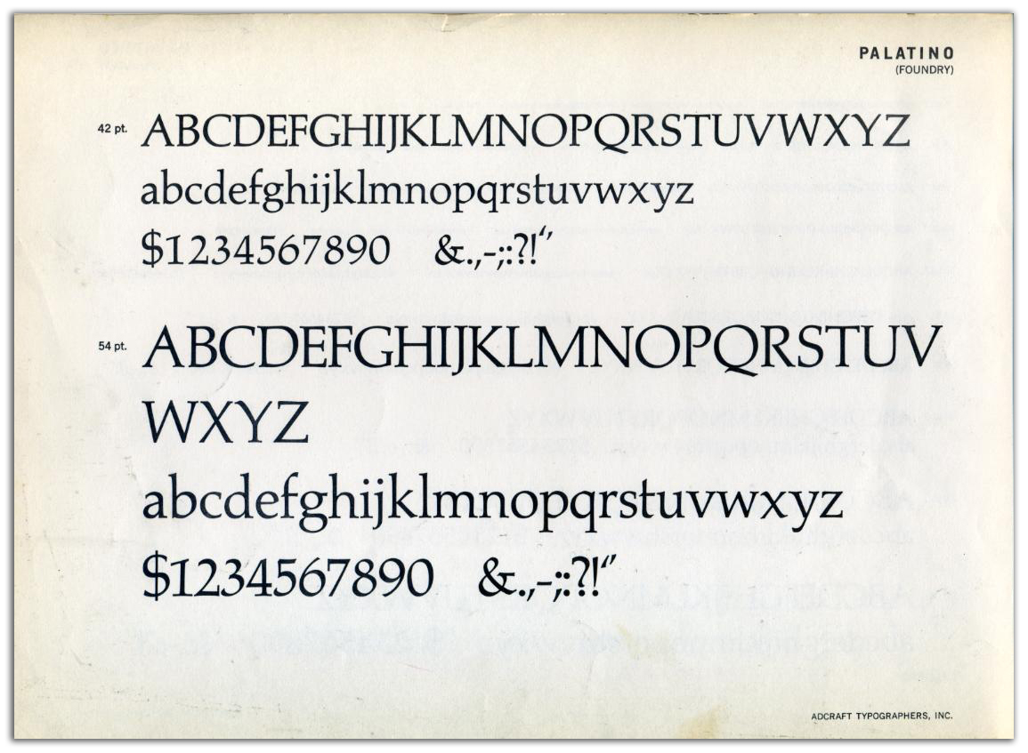
Palatino specimen from Adcraft Typographers, Inc.
Palatino originated as a traditional foundry type designed by Zapf in the spirit of an old-style serif type. It was initially released in 1949 by the Stempel foundry and later by Linotype and others. He named it for the sixteenth-century Italian calligrapher Giambattista Palatino, and the type preserves elements of lettering from the earlier fine-book tradition of the scribes who helped shape the humanist types of the Italian Renaissance. With the variable widths of curves and stems, the letterforms echo the movements of a broad nib pen, preserving a sense of the motions of the calligrapher’s hand.
Unlike most Renaissance typeface revivals, which tend to have delicate proportions, such as a low x-height (short lower-case letters and longer ascenders and descenders), Palatino has a larger x-height and shorter descenders, which we found both readable and historically appealing.
Printing and typesetting had undergone rapid change in the twentieth century. Not long after Zapf designed his Palatino foundry type for letterpress printing, the trend moved rapidly to photographic typesetting and offset lithographic printing. Zapf soon adapted his Palatino type for photographic setting and worked with Linotype to release it for photosetter. But the changes were not nearly over, and Zapf soon began exploring digital renderings of Palatino.
Which brings us back to 1987. When we began looking for a digital typeface with history, elegance, grace, and readability, we were drawn to Hermann Zapf’s Palatino for all the right reasons.
It remained the face for Tampa Review through Issue 49 in 2014. Then, as we celebrated fifty years of literary publishing, we were fortunate to be able to add a new exclusive and distinctive typeface to the journal: Companion Old Style.
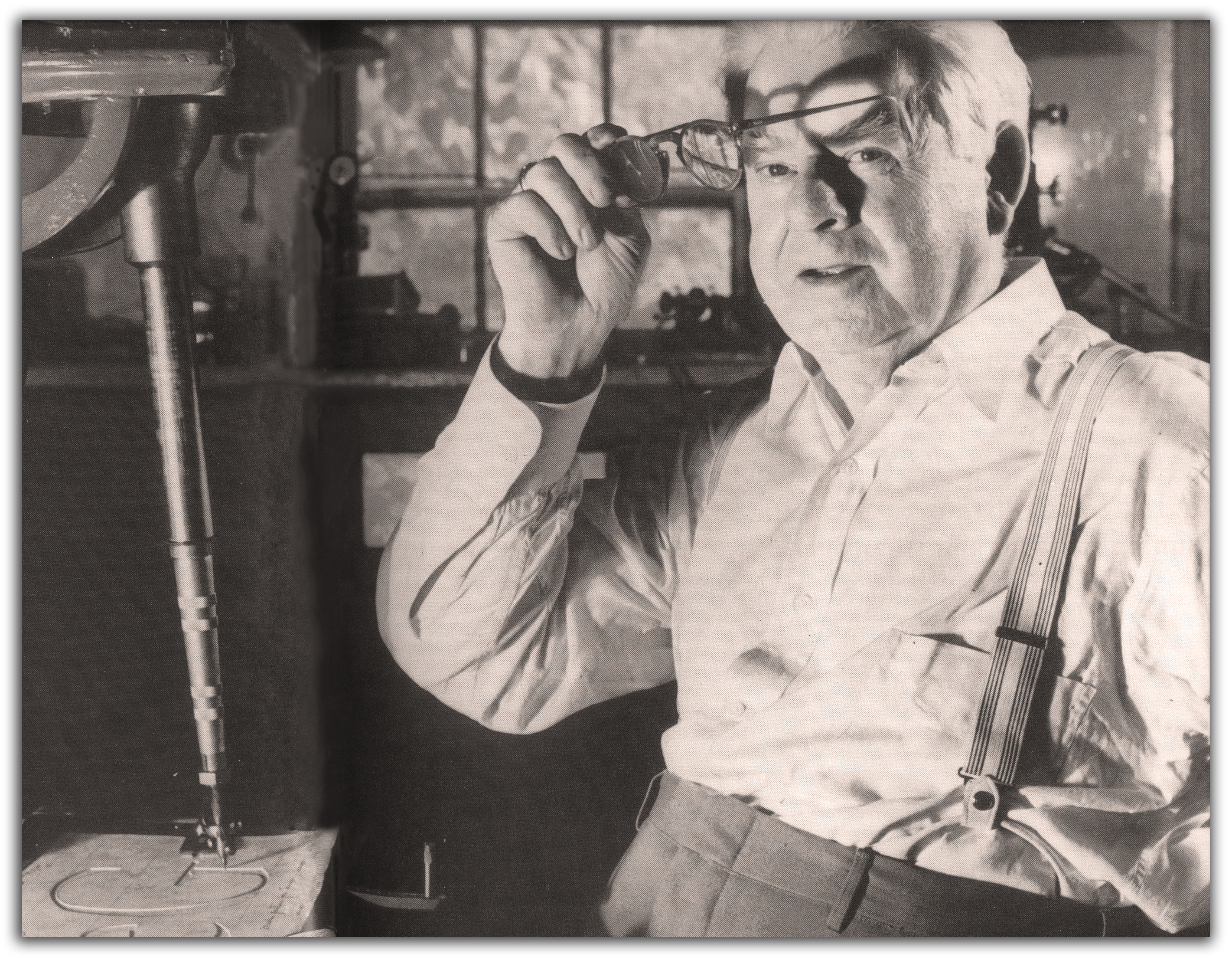
And this brings us to another story and another important twentieth-century type designer. Frederic Goudy was born in Bloomington, Illinois, in 1865, 53 years before Zapf, so he is closer to us geographically, and a little further from us in time. Goudy is probably the best known American type designer, and he conveys a commitment to handcraft and calligraphy. Goudy was influenced by the revival of fine printing inspired by William Morris and his Kelmscott Press, but he also developed his own techniques of hand lettering with an influence from advertising. Goudy became the typographical consultant of the Monotype Corporation, and he taught himself all the steps in the making of type, eventually establishing his own foundry and bringing all the processes of designing and casting types within his own hands.
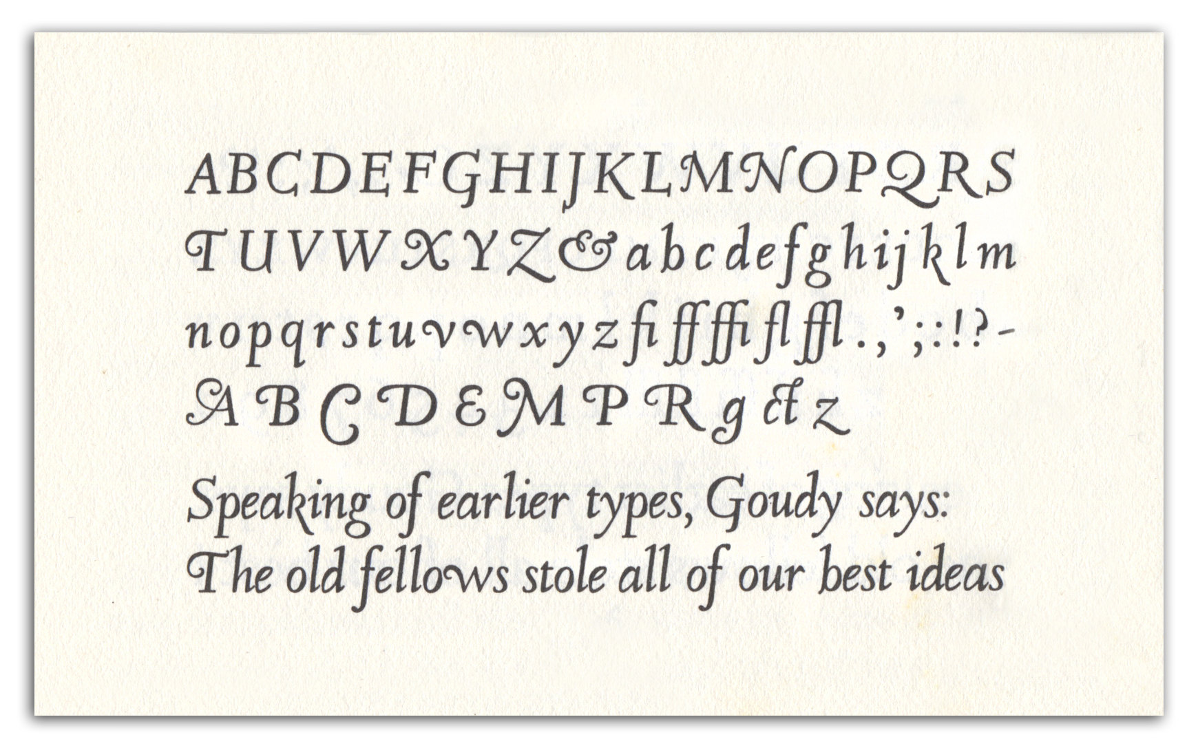
Companion Old Style Italic as Goudy displayed it in A Half-Century of Type Design and Typography.
Goudy had already achieved distinction with types issued by ATF, America’s leading type foundry, when he was commissioned by Henry B. Quinan, Art Director for the Woman’s Home Companion, to design a type for exclusive use of their magazine. The result was Companion Old Style roman and italic, which the magazine first introduced with a fanfare in June 1931. They used the type throughout the 1930s, including first presentations of literary work by Nobel Prize winner Pearl S. Buck, Willa Cather, Dorothy Canfield, John Steinbeck, Shirley Jackson, and Eleanor Roosevelt, but the type was gradually phased out and the magazine became one of the first in the US to adopt Times New Roman as a type in 1943.
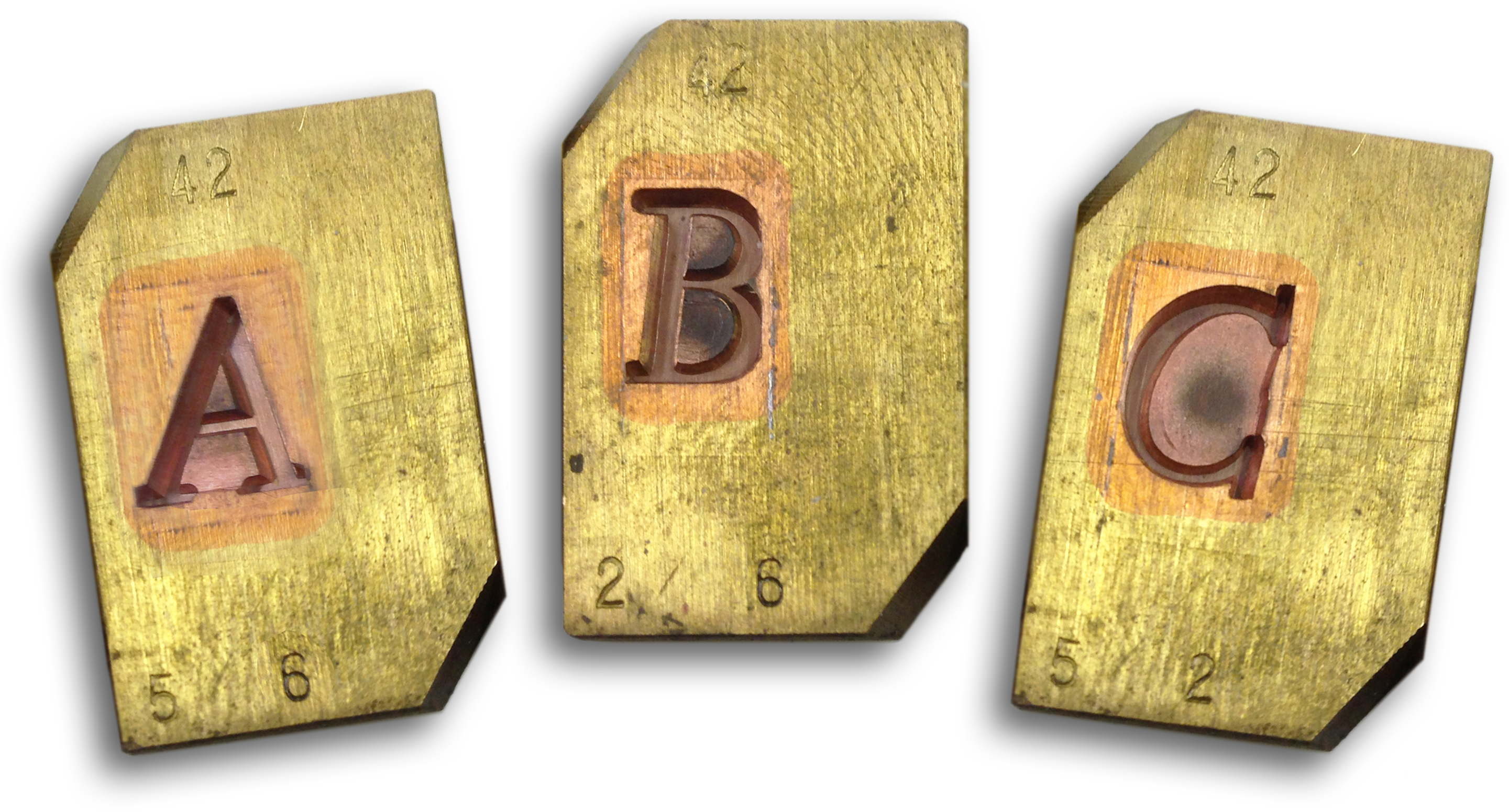
Companion was never commercially available, and it was long thought to have been entirely lost. Fortunately, a single surviving set of matrices was discovered by hobby printer Lester Feller in Chicago in 1976, and TR editor Richard Mathews and artist Barbara Russ, at that time directing Konglomerati Florida Foundation for Literature and the Book Arts, handset, printed, and bound the first book ever set in Companion types, Water Colors by the Ohio poet Hale Chatfield, issued in 1979. Many years later, after Mathews had joined the faculty at the University of Tampa, Les and Elaine Feller established the Feller Family Collections at the Tampa Book Arts Studio, and through their generosity and support from a David Delo Research Grant, the mats found a permanent home at the Studio.
While preparing a keepsake in celebration of the 150th Anniversary of Frederic Goudy, we were fortunate to learn that Steve Matteson, Type Director at Monotype Imaging, had created a digital version of Companion, and he made this available to us in 2015 for our 50th Anniversary celebration in Tampa Review 50. Tampa Review 50 marked the first use of Matteson’s version of Companion in any magazine. We were consciously seeking to express our unique identity, and given that the Tampa Book Arts Studio, our letterpress and fine printing laboratory, had just acquired the only surviving matrices for casting Companion type, we wanted to show off our rare, exclusive typeface. And we wanted our “Number 50” to look special in observance of our fifty years of publishing. We even included a hand-printed letterpress card, set by hand in metal Companion types we had cast from the long-lost matrices, proclaiming Tampa Review to be “your literary companion” for fifty years.
Companion had been designed by Goudy as a display type, and he described it as having “greater consistent original features than any other face I have ever made.” It was used in Woman’s Home Companion for titles, headings, and captions—never for text. But when digital type designer Steve Matteson showed us his new digital rendering, we could not resist a complete commitment.
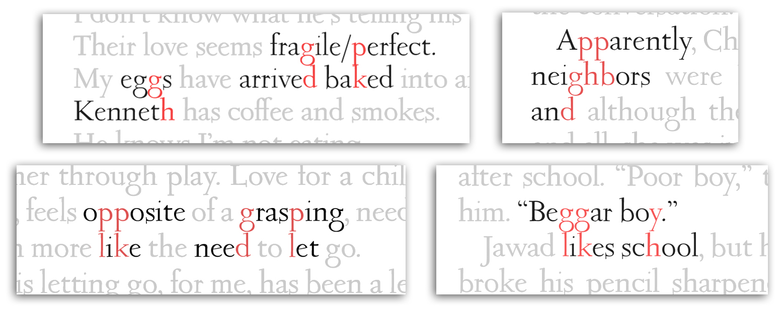
Tampa Review 50, published in 2015, was set entirely in Companion, both text and display. And it proved to be quite readable, though one characteristic of its design that worked well for titles—its unusually long ascenders and descenders—caused problems when set into lines of text. As seen in the examples below, the ascenders and descenders tended to meet. Since that time, we have experimented with Companion in a number of ways.
We made adjustments starting in TR 51/52, increasing the leading (the white space between lines), and by the time we reached TR 53, we had finessed the line spacing and were learning more about the strengths and weaknesses of Companion as a text face. Adding leading created the necessary space between lines, but it also increased the overall white space on an already “light” page, due to the delicate serifs and fine strokes of Companion. While readable in smaller sizes, the overall impact of a full page of Companion type was lighter, lacier, and more “gray” than we wanted—the “color” of a full page seemed not quite as weighty and solid as we felt the literary texts deserved.
There were also some significant practical disadvantages: the need for increased leading meant that fewer lines would fit on a page, which meant having to add extra pages (and costs) to each issue. Also, a long-term commitment to Companion for setting texts meant we would lose (and miss) the ability to use a variety of useful type weights—boldface and semibold in both roman and italic—which are often useful in designing an issue and meeting requirements writers placed upon texts.
 In short, we found ourselves thinking fondly of the font that Tampa Review had first selected—Palatino. Designed, like Companion, originally for metal type, Palatino bridged the transition from hot type to digital. Zapf himself was fully involved in creating the original foundry type and remained involved with its later release for digital typesetting. In fact, Zapf had been recognized with the Frederic W. Goudy Award from the Rochester Institute of Technology in 1969 and in 1976 was appointed to the world’s first endowed professorship in Typographic Computer Programs at RIT.
Both Zapf and Goudy were looking back with reverence at the warmth of the humanist style of letter forms, both designers preserving the thick-and-thin variations in line weight made by the pen nib in the hand of the calligrapher from the pre-printing age. These two types share open counters, wide bowls, a bracketed but nearly-hairline serif, and a readability on the page.
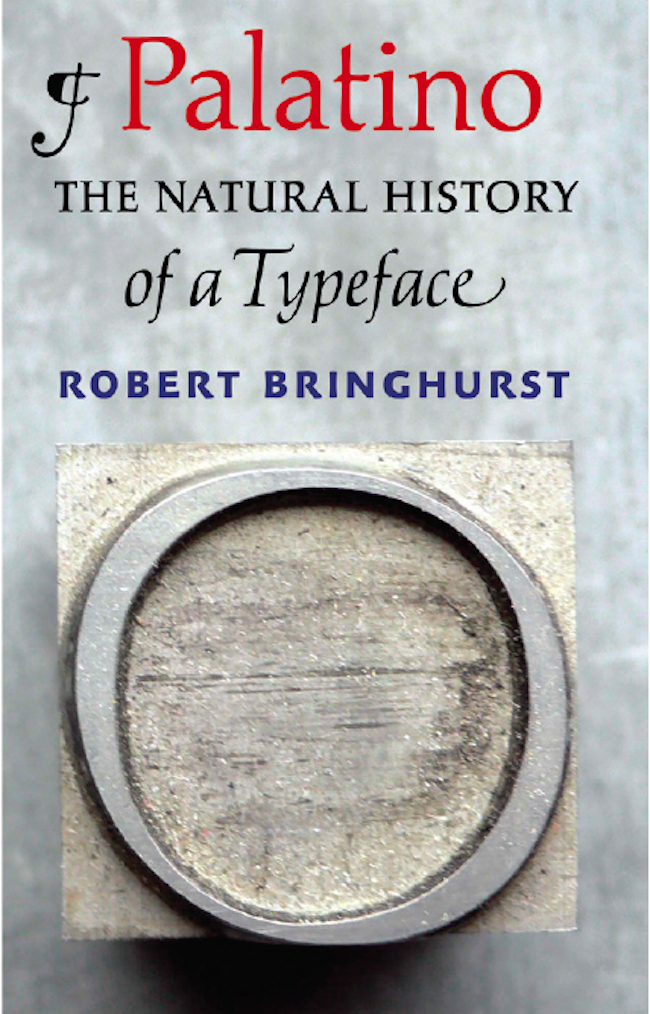 Palatino type has recently been the subject of an entire book, Palatino: The Natural History of a Typeface, by the Canadian poet and typographer Robert Bringhurst. Here he wonderfully articulates many of the values and meanings we find in both of our types. He points out that type design “traces an unspoken but close relationship between the visual arts and literature,” and he explains:
“Letters, that is, have something in common with words: they are much more, as well as nothing more, than signifiers or symbols. They are small and transitory marks made on the surfaces of things in a man-made world, yet they open into the depths of a world where humans are no more than incidental participants.” As Bringhurst reminds us, “type design can participate, like other arts, in something more important and durable than humans, namely the beauty of being itself.”
Bringhurst’s careful, intelligent, poetic and artistic study of Palatino suggests that “Letterforms have often been regarded as honorary lifeforms, inanimate and inorganic objects that can, at the whim of human beings and for purely human convenience, be described as living things.” He suggests that humans co-evolve with their languages in a symbiotic relationship “in which the profit flows both ways” and in which the present forms found in current technologies express the present moment while “retaining certain formal characteristics of great antiquity.” Hermann Zapf articulated a similar idea in a talk at the Library of Congress in 1974: “Type design is a creative art, based on the technologies of the past, which reflects the technologies of both the present and the future. Type design is one of the most visible visual expressions of an age. . . . The hand and personality of the lettering artist actually create the forms that make lasting impressions on the reader. . . . A good design has life, as does every expression of art.”
We hope that readers will subliminally sense both immediacy and history in the typeforms of our journal. With the two types in Tampa Review 54—now also visible here on the pages of Tampa Review Online—we think we have found the right combination of our original text font, Palatino, accompanied by our unique Companion Old Style, for titles and display as it was originally employed in Companion magazine. Using both typefaces we hope will be a statement of identity that connects with our own Tampa Review design history, as well as with the historic calligraphic, letterpress, and literary traditions expressed by two brilliant type designers. At the same time we continue to reach forward with digital tools as well as material artifacts to sustain the handcraft traditions and human touches we believe to be vital expressions of beauty and meaning—vital and living expressions of art.
