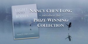
Nancy Chen Long Presents Her First Book
 Nancy Chen Long received the Tampa Review Prize for Poetry for her first book, Light into Bodies. She is also recipient of a 2017 Creative Writing Fellowship in Poetry awarded by the National Endowment of the Arts. She was born in Taipei, Taiwan, to a Taiwanese mother and an American father who was stationed in Taiwan as a linguist for the U. S. Air Force. Moving to the United States when she was young, she completed a degree in Electrical Engineering Technology, then pursued an MBA and developed a career in technology, working as an electrical engineer, software consultant, and project manager. She received an MFA from Spalding University in 2013. Her poems have appeared widely in journals including Alaska Quarterly Review, Crab Orchard Review, Pleiades, RHINO, Ninth Letter, Sycamore Review, and others, and she is author of the chapbook Clouds as Inkblots for the War Prone (Red Bird Chapbooks, 2013). She lives in south-central Indiana with her husband and works at Indiana University in the Research Technologies division.
Following the official launch of her book on May 20, 2017, Nancy discussed its publication and her plans for the next few months with University of Tampa Press Director Richard Mathews.
==============================================================================
MATHEWS: Your debut collection Light into Bodies, most recent winner of the Tampa Review Prize for Poetry, is a book about identity in many ways. It also marks an evolving identity for you as a poet. Can you comment on how the prize and the publication of your first book have contributed to your own sense of identity as a writer?
 CHEN LONG: I once heard: A writer is someone who writes. And I believe that. I believe in the right to self-identify and the power/self-empowerment it can bring. Before the Tampa Review Prize, I happily stitched ‘writer’ onto that part of my mosaic, crazy-quilt identity reserved for what one “does,” but I didn’t say much about it outside of that. For instance, maybe two people at work knew that I wrote poetry up until the manuscript won the contest. That’s because I held for myself a personal scope of being a writer and a public scope, with somewhat different aspects. I considered myself a writer in the personal sense because I couldn’t not write. And also, I have some of the telltale signs: I carry little notebooks around, scribbling down things seen and heard; I find all types of writing implements irresistible, have an obsession with paper and how it feels, with books and reading, with dictionaries and word history, with story, sound, and lyric. So that attribution in the personal sense was clear and I owned it gladly. Outside of that personal scope, there’s a rich and layered conversation going on in the world of poetry. For poetry at least, one way to gain a seat at the table is to have a book published. I didn’t consider myself a writer in that public, part-of-the-conversation sense. But I wanted to—I want to be part of the cultural conversation. Winning the Tampa Review Prize, a prize offered by a journal and press with a long, rich history of contributing to American poetry, satisfied an internal requirement. It flipped some personal, internal switch needed to give myself permission to enter into that public scope and to identify publically as a writer.
Mathews: You also recently received some very public and prestigious national recognition for your work when you were named as recipient of a 2017 Creative Writing Fellowship in Poetry from the National Endowment for the Arts. What does this award mean to you? Do you have any goals for your fellowship year?
CHEN LONG: Yes, a few months after Light into Bodies had won the prize and been accepted for publication by the University of Tampa Press, I received news about the NEA grant. Either one of those awards in itself is overwhelming. To have received both within a short period of time was a shock.  It was the second time I had applied for the fellowship. I feel lucky to have been selected, especially in light of the future life of the NEA. I’m alarmed by the possible defunding of the NEA. The NEA not only enriches lives, it changes lives.
It funds not only individuals, but art organizations as well. I looked up some statistics I remember from a ThinkProgress article on the NEA: “About 40 percent of NEA projects are in high-poverty neighborhoods, while 14 percent of NEA grants are for projects that at least partially impact rural areas. Another quarter of state agency grants are awarded to rural places, many of which disperse NEA money.” I am grateful to the NEA for the necessary and good work that they do.
The combination of the Tampa Review Prize and NEA fellowship is a gift of public affirmation, and I am more confident as a writer with respect to my seat at the table in the literary conversation. The affirmation of both UT Press and the NEA challenges me to dig even deeper into the creative process, to give back to the literary arts and writing community as I am able, and to make a difference and help other writers where I can.
My goal is to complete a second manuscript, which is turning into an obsession with the intersections of art, science, and religion, the language we create to name and map those ideas and interactions, and how language mediates, bridges, and serves as connective tissue. This obsession requires much in the way of research, so I’ll likely ask for a one-year extension to complete it.
MATHEWS: You recently celebrated publication of Light into Bodies with a book launch at The Crazy Horse in Bloomington, Indiana. Could you describe that event and how it came about?
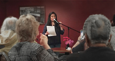
CHEN LONG: The Crazy Horse is one of the oldest restaurants in Bloomington. Rumor is that it used to be a brothel. It has a charming private room in the back with dark-red walls, one of them all brick, and a full bar—an appropriate place for the event because it looks a bit like a beatnik bar. The event took place on Saturday afternoon. It came about because a dear friend wanted to hold the launch event for this book. She organized it, evaluated venues, selected the food and wine. There were appetizers, brownies, beer, and wine, as well as non-alcoholic beverages. We spread the word through emails and social media. Since this event was not only a book launch but also a thanks-giving, a way of honoring some of those who helped me back to writing and poetry, there was a short program in which friends read poems and played music.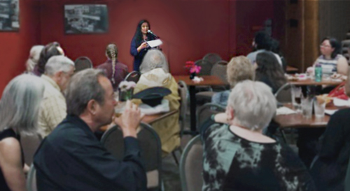
MATHEWS: It sounds great . . . and it seems from the photos that it was an ideal way to celebrate the publication. It seems to be a grounded and natural transition from the personal to the “public scope” you mention. Beyond the writing of the book, now that it has been published you are entering a more public mode and facing the task of helping to find ways to reach readers. For someone with a first book, you have been thinking especially clearly about good ways to help this happen. How have you come up with such good, practical approaches? Have the suggestions come from writer friends? Or is this mostly through reading you have done?
CHEN LONG: All the while, while sending out the manuscript, I cataloged ideas I ran across regarding how to promote your book. Some of the ideas came from colleagues who attended Spalding University, where I received my MFA. Spalding has a strong alumni association and each year at the homecoming residency there’s a session on publication and promotion. I also picked up ideas and resources on social media. For instance, I participate in a number of Facebook groups related to writing and poetry. The topic of promoting one’s book is a common subject. There are many generous and creative people out there willing to share their good ideas. Also, it helps to be a good literary citizen. I’ve been interviewing poets and writing poetry book reviews for a number of years on a couple of blogs as a way the help promote other people’s work. When Light into Bodies was released, I already had some contacts for reviews and such.
MATHEWS: You also had a reading at Spalding University, a sort of second launch, in their Festival of Contemporary Writing. Tell us a bit about that event.
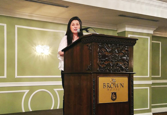
CHEN LONG: Yes, Spalding has a Festival of Contemporary Writing that includes invited speakers as well as a “Celebration of Recently Published Books,” in which faculty and alumni read from their recent works. This year the Celebration was held on June 2 at the Brown Hotel in Louisville. If you’ve never visited the Brown, you’re in for a treat. It’s a lovely building listed on the National Register of Historic Places and where Louisville’s most famous dish, the Hot Brown, was created. The architecture is beautiful—it was built in the Georgian Revival style. I read there along with other alumni: Linda Parker, who released her novel Oliver’s Song; Al DeGenova, who read from his poetry collection, Black Pearl; Mary Popham, who read from her novel Love Is a Fireplace; Kathleen Thompson, whose creative nonfiction book Time & Distance was just published; and David Dominé, who read from his work, Voodoo Days at La Casa Fabulosa. There was a reception and book-signing, afterwards—what Spalding calls SPLovefest—with hors d’oeuvres and an open bar. Other alumni sell their books as well at SPLovefest. It’s wonderfully celebratory.
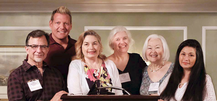
(Recently published Spalding alumni: From left: Al DeGenova, David Dominé, Linda Parker, Mary Popham, Kathleen Thompson, Nancy Chen Long)
MATHEWS: What other appearances do you have planned over the next few months?
CHEN LONG: Here are the other readings planned through August so far:
Friday, June 23 • 7 pm
Reading with Christine Rhein
Nicola’s Books
2513 Jackson Ave, Ann Arbor, MI 48103
For more information:
http://www.nicolasbooks.com/event/poetry-nancy-chen-long-and-christine-rhein
—————
Tuesday, June 27 • 7 pm
Reading with Janeen Pergrin Rastall and Milton J. Bates
St. Ignace Public Library
110 W. Spruce Street, St. Ignace, MI
For more information:
http://joomla.uproc.lib.mi.us/stignace
—————
Saturday, July 8 • 7 pm
Reading with Karen George
Chase Public
569 Chase Ave, Cincinnati, OH
For more information:
https://www.chasepublic.com
—————
Friday, July 14 • 7 pm
Reading with Shasta Grant and Nate Logan
Indy Reads Books
911 Massachusetts Ave, Indianapolis, IN
Click here for more information about this event
—————
Sunday, August 13 • 3 pm
“Second Act: Reading and Conversation with a Local Poet”
Monroe County Public Library
303 E Kirkwood Ave, Bloomington, IN
Click here for more information about this event
MATHEWS: Will you be posting announcements of these upcoming events somewhere?
CHEN LONG: Yes, I’ll be posting them on the Events page of my website: www.nancychenlong.com/events
MATHEWS: Can readers interested in arranging a reading or book signing contact you through your website?
CHEN LONG: Yes, folks can contact me there—www.nancychenlong.com/contact or email me: info@nancychenlong.com
–––––––––––––––––––––––––––––––––––––––––––––––––––––––––––––––––––––––––––––––––––––––––––––––––––––––––––––––––––––––––––––––––––––––––––––––––––––––––––––––––––––
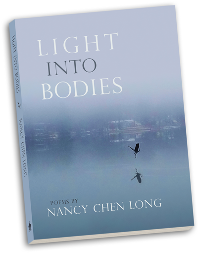
Light into Bodies is available from the University of Tampa Press
in both paperback and hardback editions.


 Project Muse still remains the exclusive online source for